Ever since the rise of ChatGPT in 2023, the web has gotten worse. Not a little worse. Significantly worse. Websites now have more unnecessary shadows, linear-gradient buttons, buttons that pop when active, and in general this glowy, red light district, trying to be futuristic look. And not to forget the weird scrolling animations. Websites now have way more features, but way less that actually work. The worst vibe coded websites have buttons that dont do anything if you look a little into it. They're facades.
The issue is AI has been trained on a concept that was already bad. The peak of the internet was in the 2010s. Websites were super simple, but functional. Around 2018 things started to decline. Everyone was trying to be more modern and aesthetic. More big images, smaller buttons. This caused websites to become more confusing. Up to the point where you can barely book a hotel room on some hotel sites. Think about that. A hotel website that makes it hard to book a hotel.
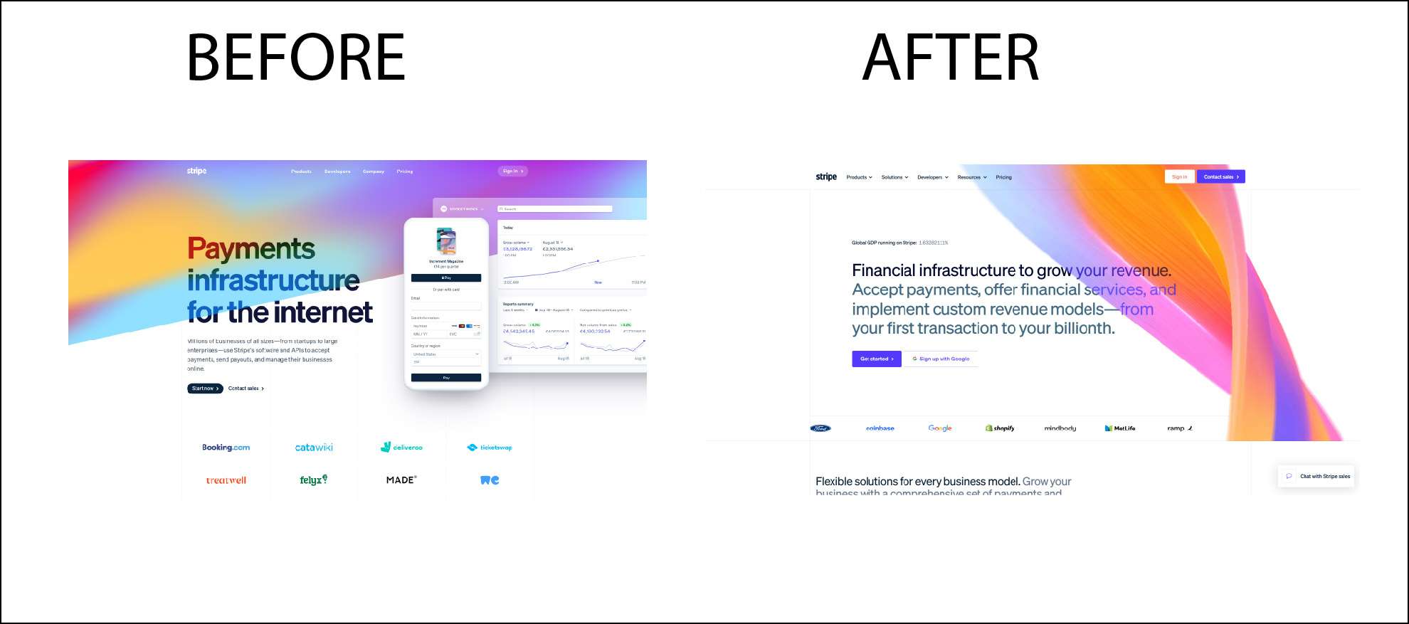
Surprisingly, the only website that I have seen reverse some of these changes is the Stripe main page. It was trying to be this sleek modern Apple kind of site before. Now they have reverted their main index.html to be more solid, more rugged. You could almost say older looking. And that really is a genius change. Websites in my opinion should be all about functionality. Not style. You want people to sign up or buy something. Not be amazed by your sliding image cards. Nobody ever bought something because of a parallax scroll.
The linkifier.me site took all of these concepts. We said screw it. Lets cut out all the crap. Lets even cut out the lifestyle branding parts. No cropped images of a few hipster girls drinking matcha, no bullshit. You came to our site to generate a landing page, probably for your socials. And thats what we give you. Straight up. Even without a sign up.
Compare our site to all of the vibe coded garbage that has emerged. Then you will see the difference.
I remember when starting this project 9 months ago, a competitor said that nobody would be interested in a 2000s outdated link generator. And thats when I knew I was spot on. When someone in this industry tells you your product is too simple, you're doing something right.
Websites need to become simple again. Product focused, sales focused. But unfortunately with AI this is only going to get worse. I will continue the fight for no sign up, fast, Javascript pages, like the linkifier. And I stand against React, tailwind vibe coded slop that was made in a day. Its not useful. Its clogging up the web. We need no fake reviews. We need no QA with fake questions. Its really enough.
Look at the video below, that will tell you everything. Thanks for your attention.